
Motorola Stio
For this passion project, I decided to redesign a nonprofit organization’s website whose mission aligned with my values. In this redesign, I focused on what aspects I could help improve on the organization’s original website and centered on the color palette, navigation, and layout features.
MY ROLE 👩🏻🔧
Solo UX DesignerDURATION ⏱
30 hours
TOOLS 🛠
FigmaProblem
Alliance for the Great Lakes’s website lacks an efficient user experience due to difficult navigation and layouts.
How can we improve upon their current website to promote a better user experience while maintaining the integrity of the organization?
Solution
I conducted user research, interviews, and testing, to understand effective web designs for a nonprofit and improved the color usage, user navigation, and information layout based on research analysis.

Overview

The Current Website


I chose to redesign this website because it was promoting a cause that is close to my heart. As being someone born in Chicago, Lake Michigan has been a part of my entire life which is why I knew this would be something passion driven.
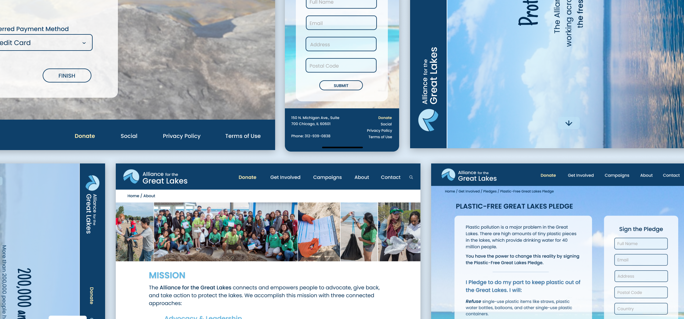
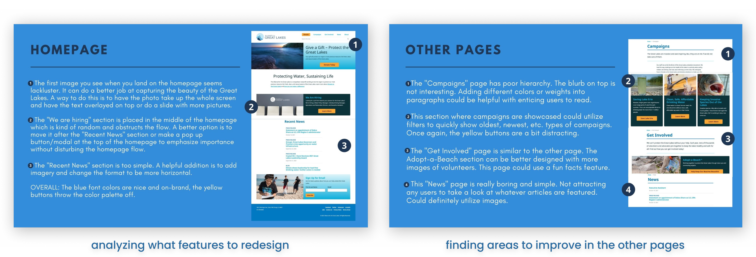
Below are screen captures (during the time I was working on this project) of the Alliance for the Great Lakes website from 2022. The website had a loud color palette and a lot of content on each page. They mainly utilized visual imagery through out their website and each page had at least 5 call-to-action buttons. The page layout consisted of multiple sections of different categories.
The cards utilized in their website are straightforward but filled with information and difficult to navigate through. Visuals aids are included throughout the website.
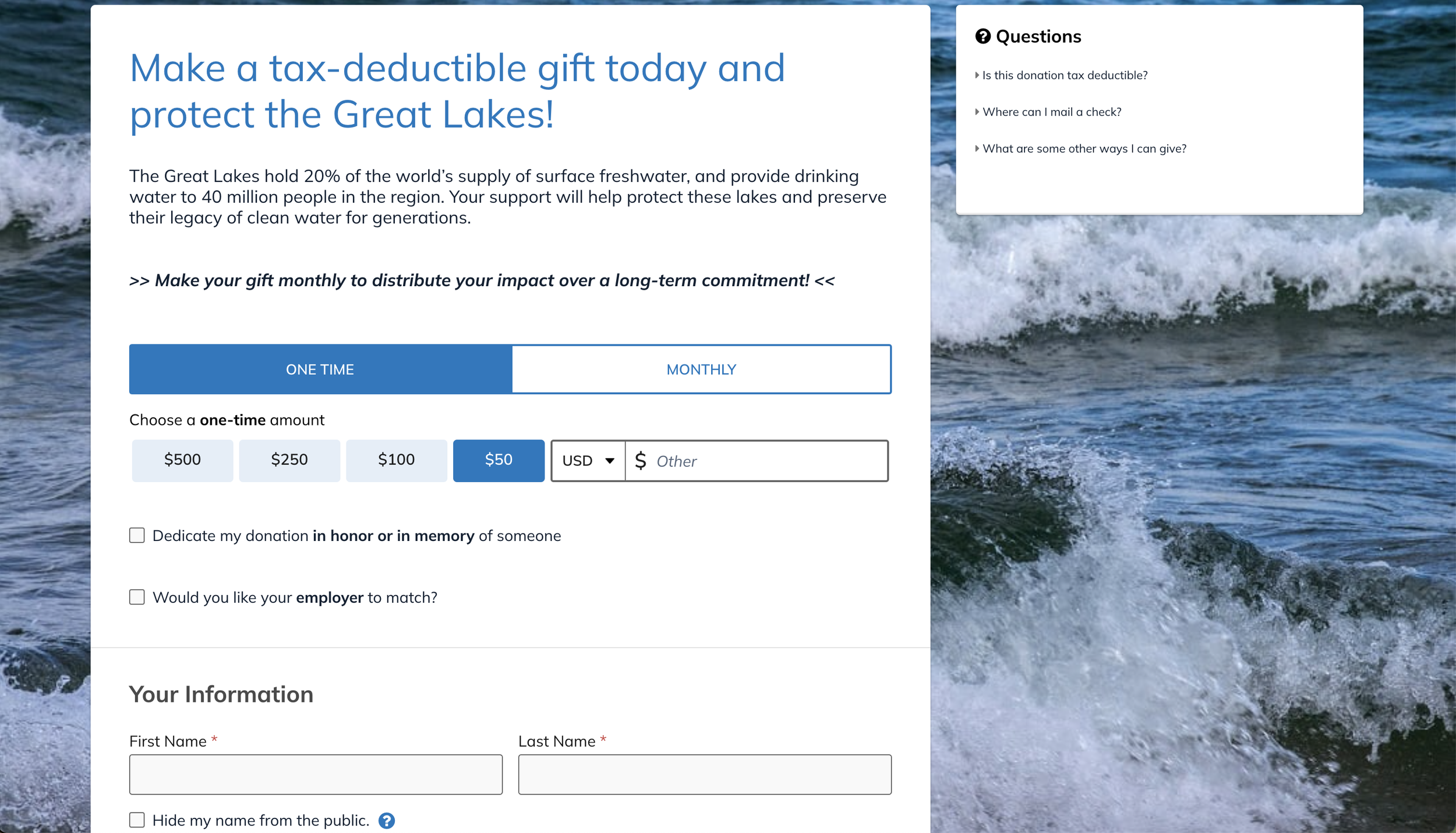
Their donation page has a very different design layout compared to the rest of the website.

01. Competitive Analysis
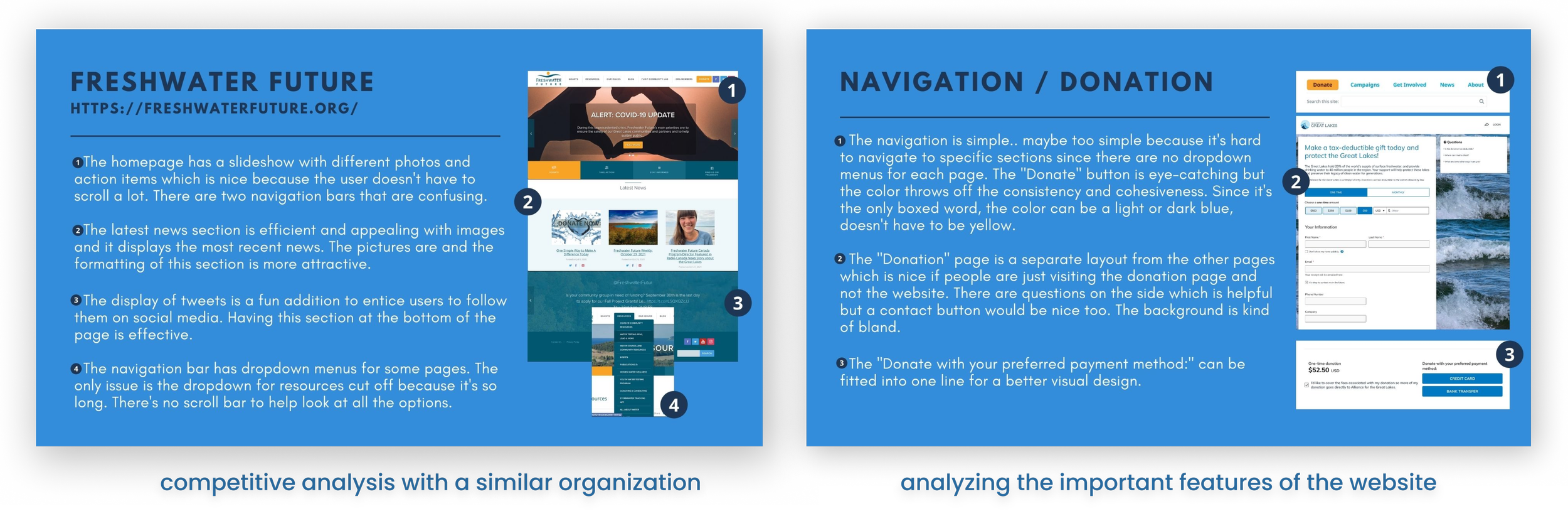
Below are several competitive analysis I did to understand more about UX design for nonprofits. I analyzed different nonprofits that had a similar purpose to the Alliance for the Great Lakes and I focused on specific pages to decipher any commonalities or unique features.
02. Benchmarking
Below are several competitive analysis I did to understand more about UX design for nonprofits. I analyzed different nonprofits that had a similar purpose to the Alliance for the Great Lakes and I focused on specific pages to decipher any commonalities or unique features.

01. Interviews
I conducted around 5 interviews of various participants to determine what users thought of the current website and its features. Through these interviews I was able to understand the user flows and struggles they encountered. The insights guided my design process.
Pain Points
Possible Solutions
• Difficult navigating throughout all the pages and sub-pages that are on a page
• Content layout is overwhelming
• Users struggled with searching for specific things in the website like topics or events
• Design an improved menu with dropdown options to categorize all pages efficiently
• Redesign the content layout and utilize better hierarchy to help ease user’s experience
• Determining what content is important and highlighting them
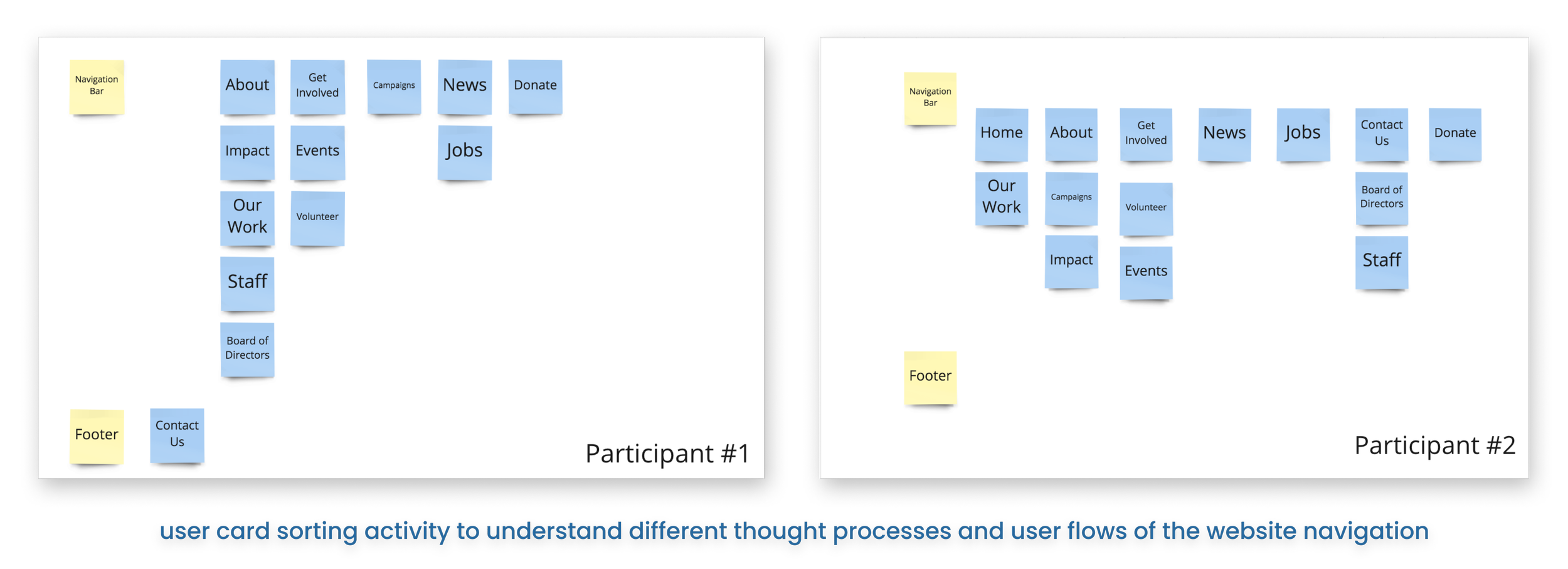
02. Card Sorting
03. Heuristic Analysis

A part of the interviews was having my interviewees do this card sorting activity. I give them all the potential pages for the menu and navigation and allow them to sort and lay out everything in terms of what they think is best. The insights help guide the designs.
I also ask my interviewees to browse the current website and try to answer the heuristic analysis questions. The questions are specific to the website features and this analysis helped me understand the user flow and how smooth the user experience is on the current website.
04. Information Architecture
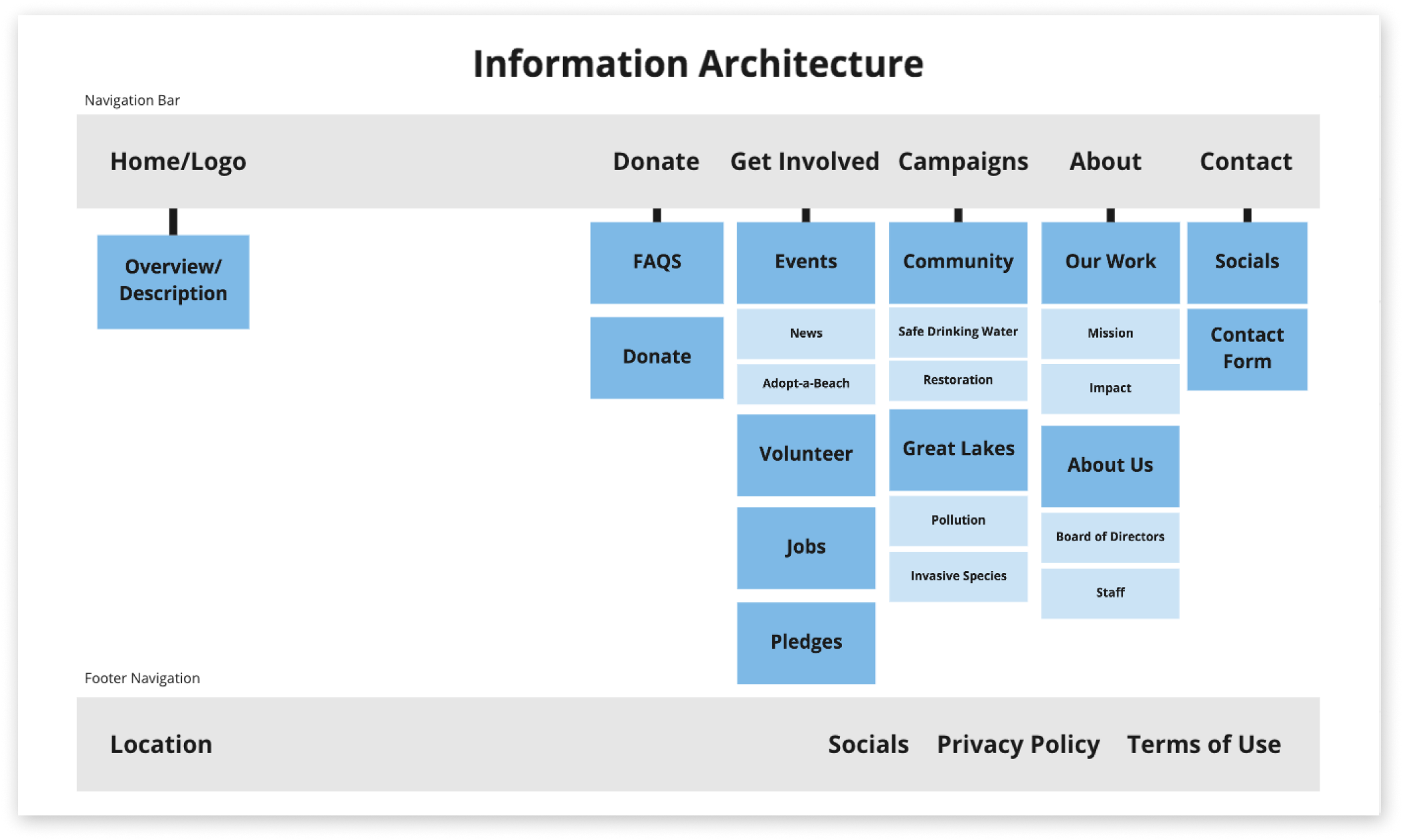
Based on my interviews and research analysis, I created this information architecture to lay out the navigation menu that prioritizes an intuitive user experience.

01. Moodboard & Branding


Beginning the design process, I first establish the color palette of the website and the branding. I focused on a mainly blue color palette which plays off the Great Lakes and one stand out color for any elements that I may want to draw the user’s attention. The branding is to bring awareness to the beauty of the Great Lakes and work with what the website already has to offer but simplifying the designs.
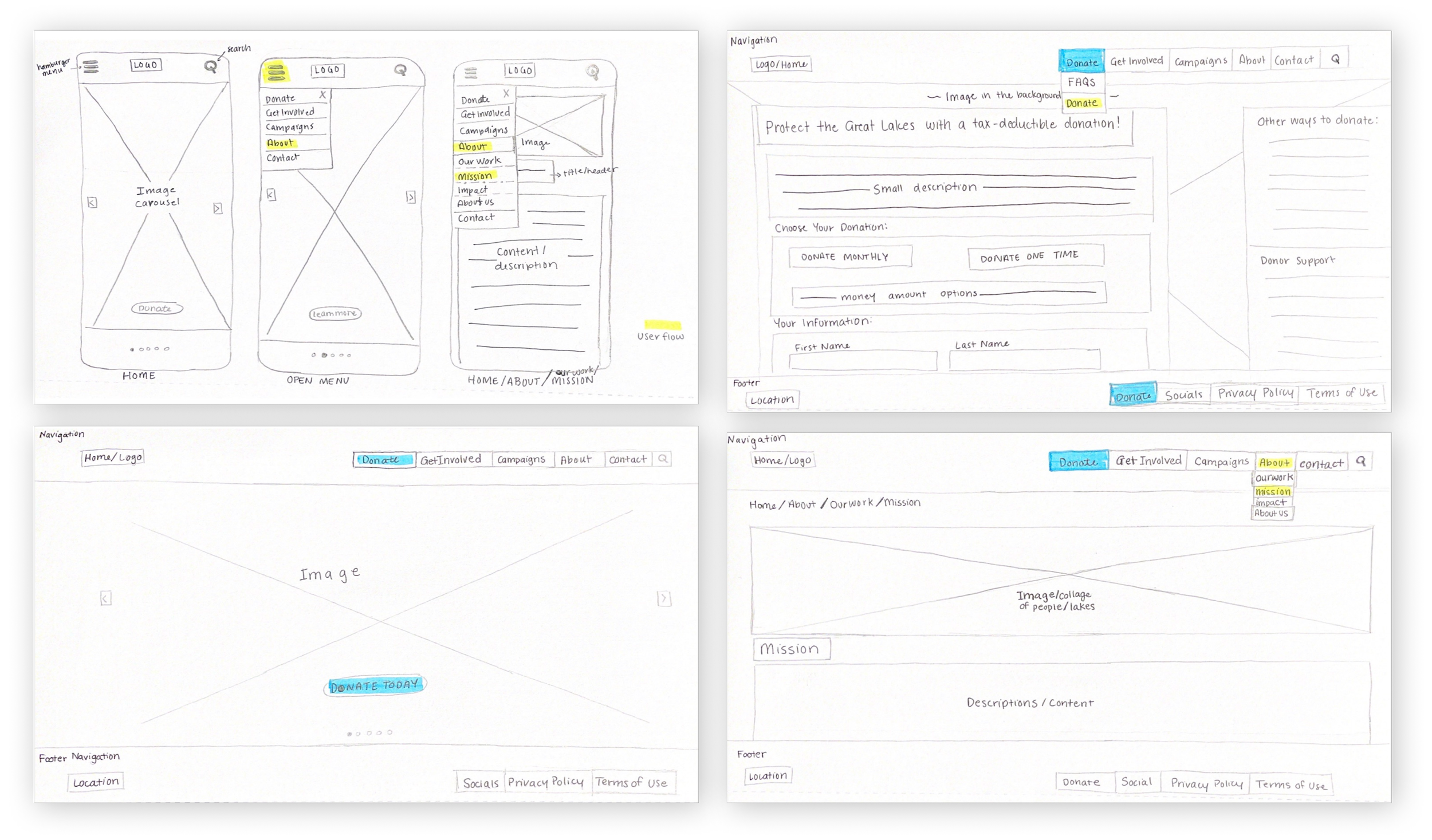
02. Sketches
Before going into creating any digital designs, I always sketch out any ideas or potential designs. For this project, I sketched out web designs as well as mobile designs to ensure the designs are have a smooth responsiveness across all platforms. The blue highlight signifies the what feature will have the stand out color. The yellow highlights the potential user flow that is shown in the prototype.
03. Wireframing & Low Fidelities
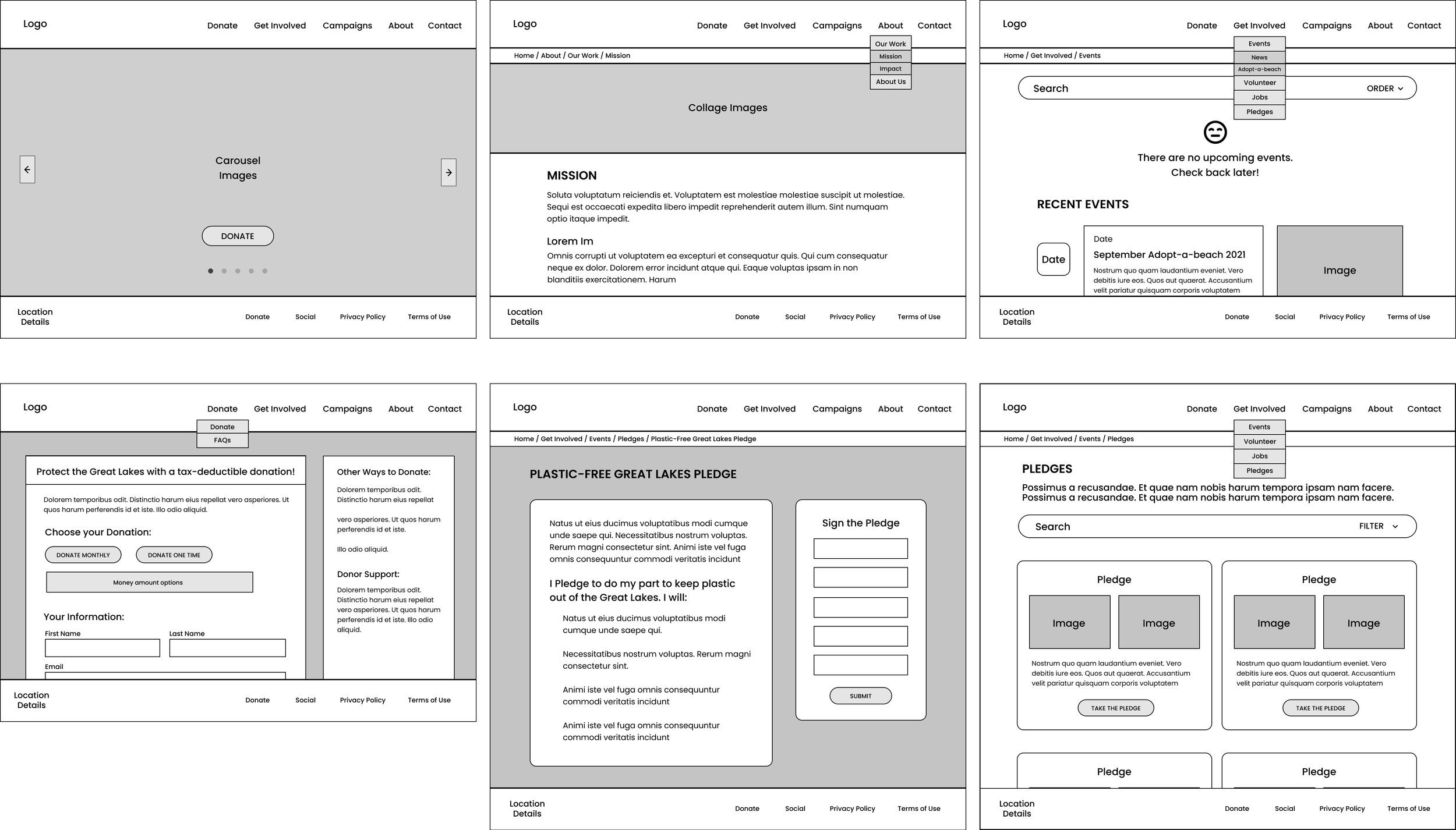
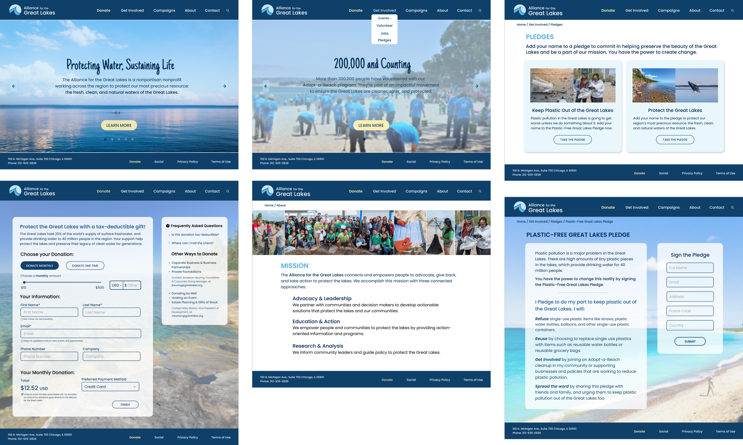
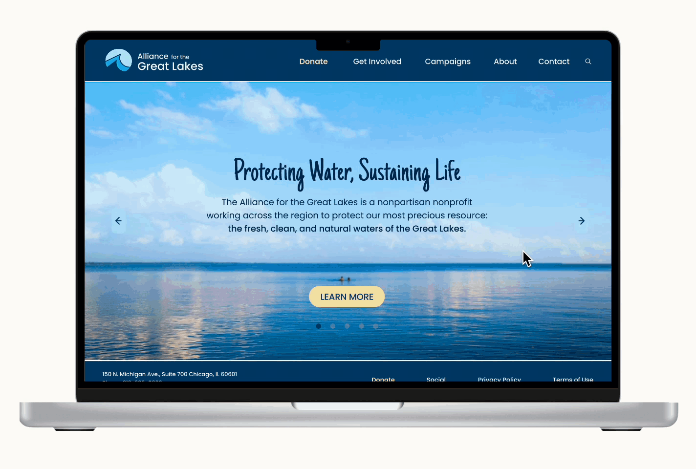
Based on my sketches, I created simple wireframes and built out my low fidelity prototype. Some key changes I added in my redesign are: a new landing page with a carousel to showcase the beauty of the Great Lakes and putting emphasis on the visuals, dropdown menus in the navigation bar to improve navigation experience, redesigned the page layouts, and added some new pages.

04. High Fidelities


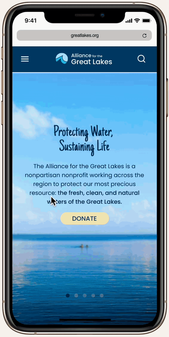
When wireframing the mobile version of the website, I took into account the user’s attention span and the amount of content so there is minimized scrolling.
After creating my low-fis, I continue on with designing the high fidelities. This is where I implemented the color palette and branding and all the finishing touches to bring the redesign to life! The redesign’s purpose was to bring cohesiveness and efficient functionality for the user experience. The website, leaned towards a more modern and happy style thus leaning heavily on visual imagery and colors.
I wanted to emphasize the use of hierarchy through color or type sizes in these redesigns because some interviewees mentioned the original website felt disorganized making it harder to navigate throughout the many pages. The main call to action button is highlighted by the yellow color. Making the all the page and resources easily accessible makes it easier and more encouraging for users to contribute — bridging both the organization needs and the user needs for an effective experience.

Mobile Version Prototype
In the mobile version, I condensed any overwhelming content so users are not seeing too much text when browsing and have . The navigation bar transforms into a sidebar menu. Besides these main changes, most of the website is similar to the desktop version.
The final prototypes are below and the user flow goes through the redesigned landing page, newly added dropdown menu, newly added pledges page, redesigned about page, and redesigned donation page. I wanted to highlight these specific pages because they were the most important for the redesign.
Website Prototype
The website prototype flow shows the redesign of the landing page and its focus on a simple and visually centered style. The prototype also shows some new features like the dropdown menu for an easier navigation experience.
A new page I added is the Pledges Page. In the heuristic analysis, users struggled to find where to even sign a pledge and this form of user engagement should be easily accessible. Therefore, I added pledges as its own page.


This project is one of my favorites because I was able to design with the most creative freedom as well as working on something that I felt strongly about and aligned with my values as a person. I realized, it can be challenging to achieve a seamless user experience whether it be a website or an app and the process is long but rewarding when designing for the betterment of people’s daily lives.
My biggest challenge was managing this project and finishing it in a good amount of time. Because this was a passion project, I did it on my own time and when I did find time to do it I would work on this for a couple hours. However, when my schedule was full, this project got put to the side. But every time I worked on it, it was very fun and invigorating so I never left the project alone for too long.
Key Takeaways:
When you start with a solid foundation, the later parts of the design process comes to you smoothly. I think this project taught me the strength of good wireframing and low-fidelities. These elements of the project tied everything together.
Working alone can be challenging and rewarding. This was my first entirely solo project so it felt taunting but exciting. I got to go at my own pace and learn about my strengths and weaknesses as a designer.
❤️ A Lil’ Fun Story:
The image on the right was taken during summer of 2021 at the Chicago Lakefront trial by the Field Museum. Behind me is Lake Michigan, one of the Great Lakes. Despite the pandemic, I always tried to go out and experience the summer in Chicago by the lake and that year it was while wearing a mask and social distancing.
I love the Great Lakes!