As a relatively new app released in 2018, we recognized that there were areas for improvement and had the potential for growth. Now with over 100 million downloads, we wanted to challenge ourselves to improve this application for an array of users and the increasing amount of podcast listeners.
Go to the brick house o

Problem
Google Podcasts offered no customization or community for users. The layout and visuals made it difficult for users to navigate the app efficiently.
How might we foster a connection within the application and improve user flow when using the app…?
Solution
My team and I redesigned and implemented new features for the Google Podcasts app to retain user engagement and optimize app layout for better navigation and experience.
Overview
MY ROLE 👩🏻🔧
UX Designer focused on the user profile customization features
DURATION ⏱
4 months, September to December 2021
TOOLS 🛠
Figma



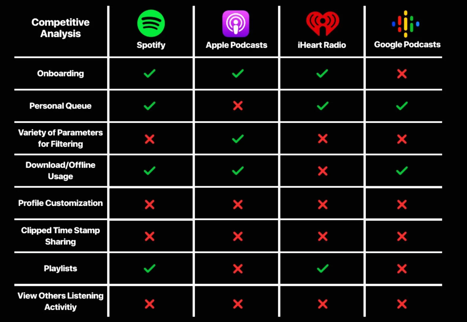
Starting off, my team and I focused on mobile apps and chose several competitors of Google Podcasts such as Spotify, Apple Podcasts, and iHeart Radio, and compared their capabilities.
We discovered that iHeart Radio and Google Podcasts have the least capabilities. Although, iHeart Radio focuses more on live broadcasts which can explain its lack of abilities. But overall, the analysis shows that most podcast apps on the market offer only basic abilities and have room for improvement and growth.
With this analysis, we had an idea of what we could target for our redesign of Google Podcasts such as introducing better profile customization and clipped time stamp sharing.
Affinity Mapping
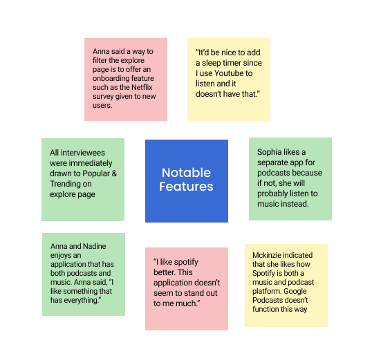
After our competitive analysis, we interviewed 15 people of different backgrounds and ages about their experiences and thoughts on podcasts and the Google Podcasts app. The interviews gave us great insights into pain points and user needs. We categorized their responses through affinity mapping which helped our team organize the insights and pinpoint what issues to tackle.
Competitive Analysis


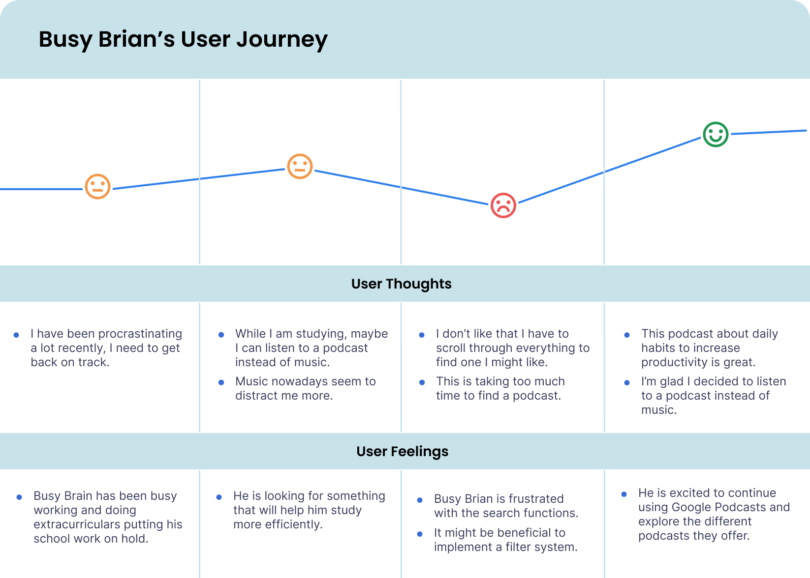
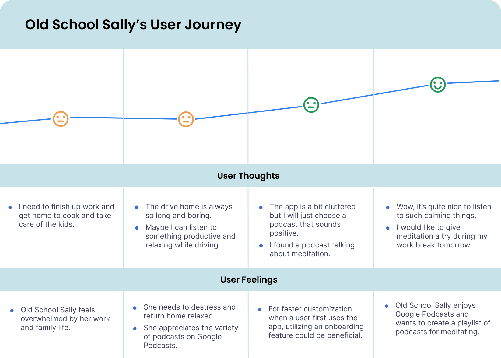
We developed user personas based on our research and understanding of the user interviews. Old School Sally and Busy Brian are personas that represented common users of Google Podcasts and typical podcast listeners. These personas and user journeys helped us envision important user needs and expectations. Old School Sally may need some form of organization to quickly access her go-to podcasts while Busy Brian may need easy navigation and layouts.
Personas and User Journeys
Information Architecture

After establishing our potential users, we mapped out all our research and information in an Information Architecture. This encouraged us to explore more user journeys in an easy and organized system. We focused on constructing information for four main features of our redesign: Onboarding, Home Page, Explore Page, and the Activity Page.

Pain Points & Design Objectives
Based on our research and analysis, we noticed some key issues we had to address in our redesign: navigation, search features, visual layout, and user retention. It seems like users are more drawn to other podcast services due to better design in these areas. Google Podcasts was not offering as much as what users have experienced on other platforms. Therefore, we decided to tackle this problem through our redesign of the app.

The Current App

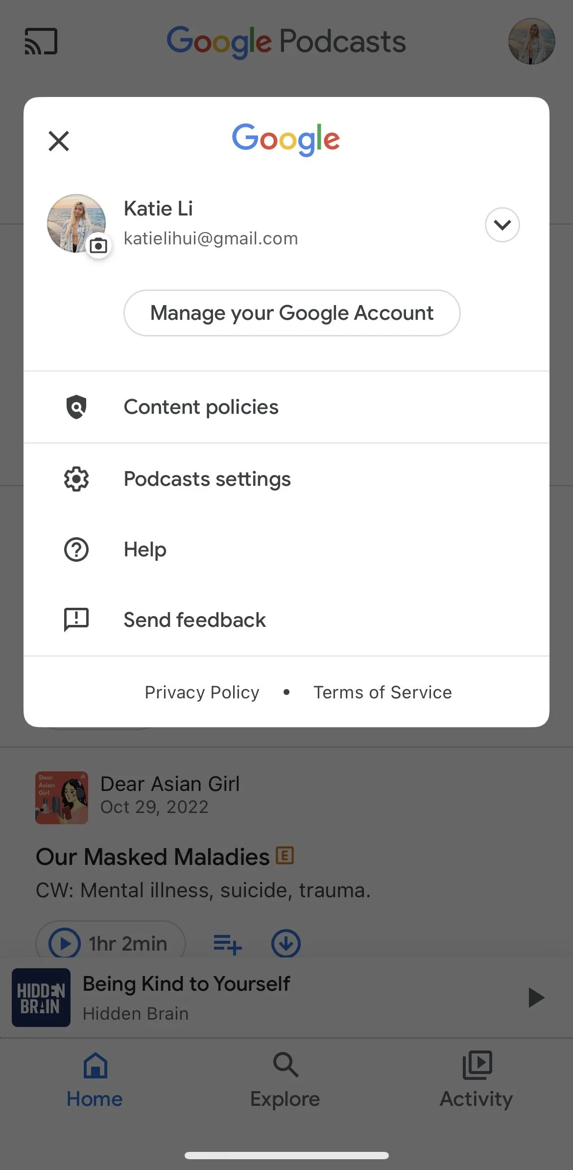
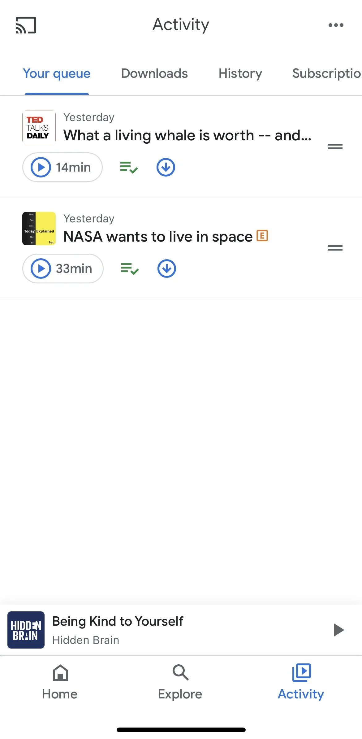
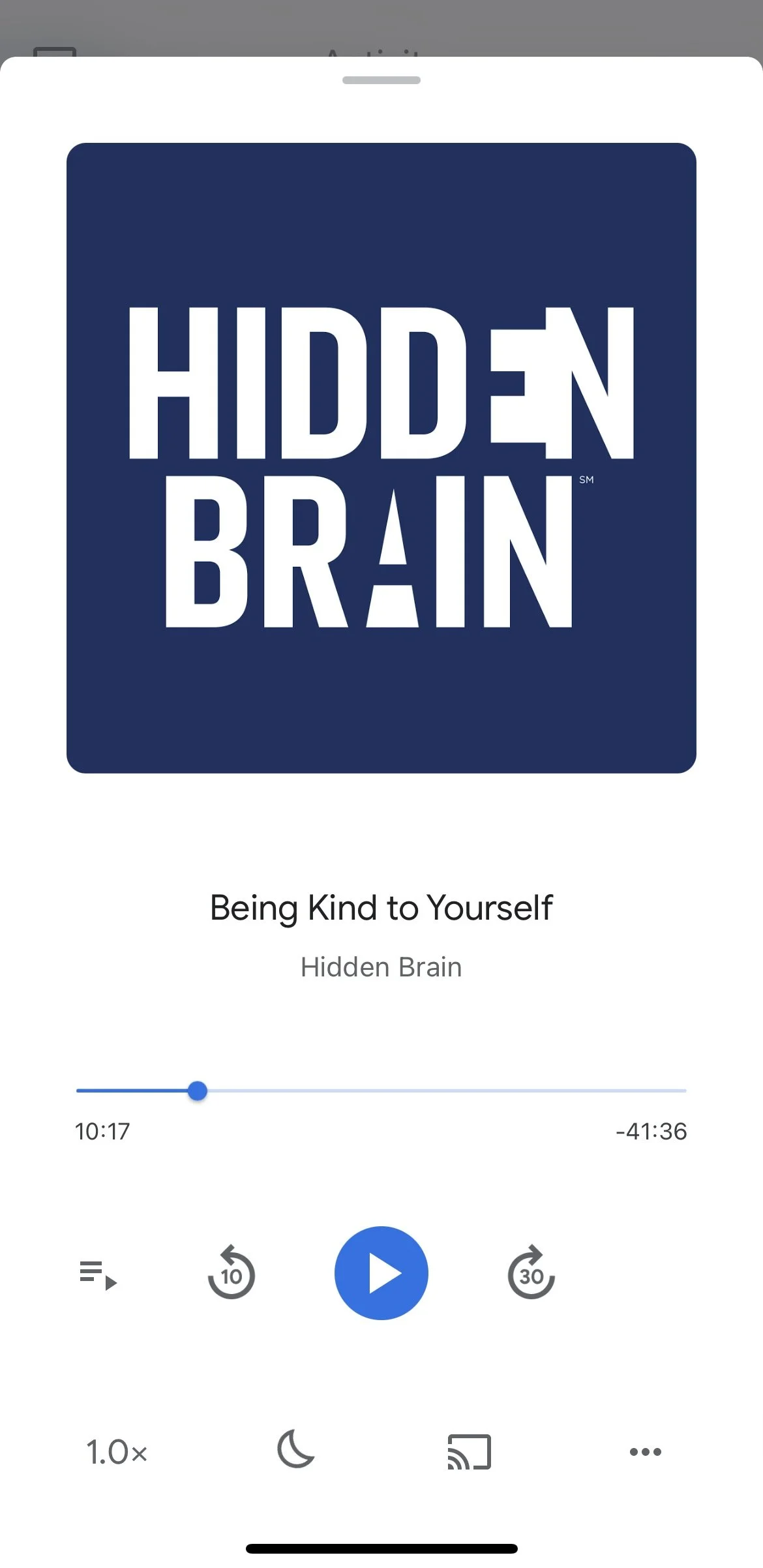
Opening the Google Podcasts app takes the user to the home page which is laid out in a simple linear format. The profile icon allows the user to access their general Google account linked to their email. As one of our interviewees said, the app is reminiscent of Google search results, feeling familiar but bland and hard to navigate.
Low-Fidelity
Sketching
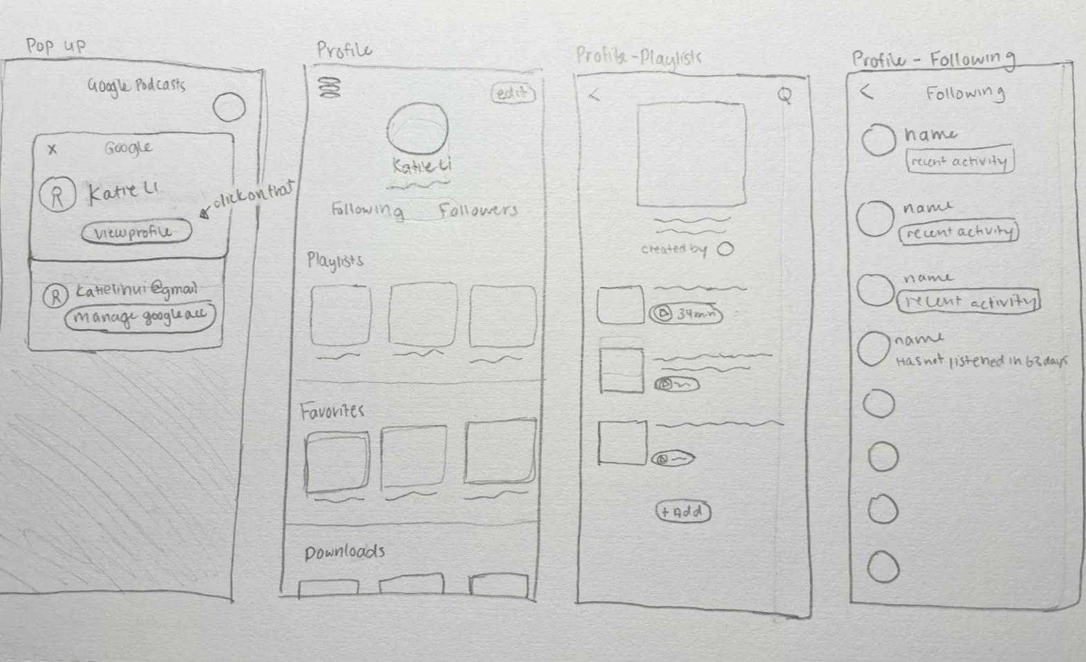
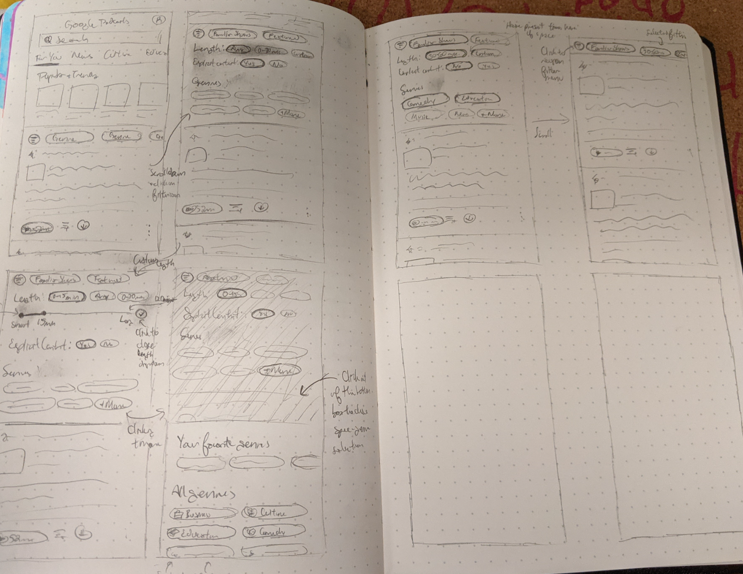
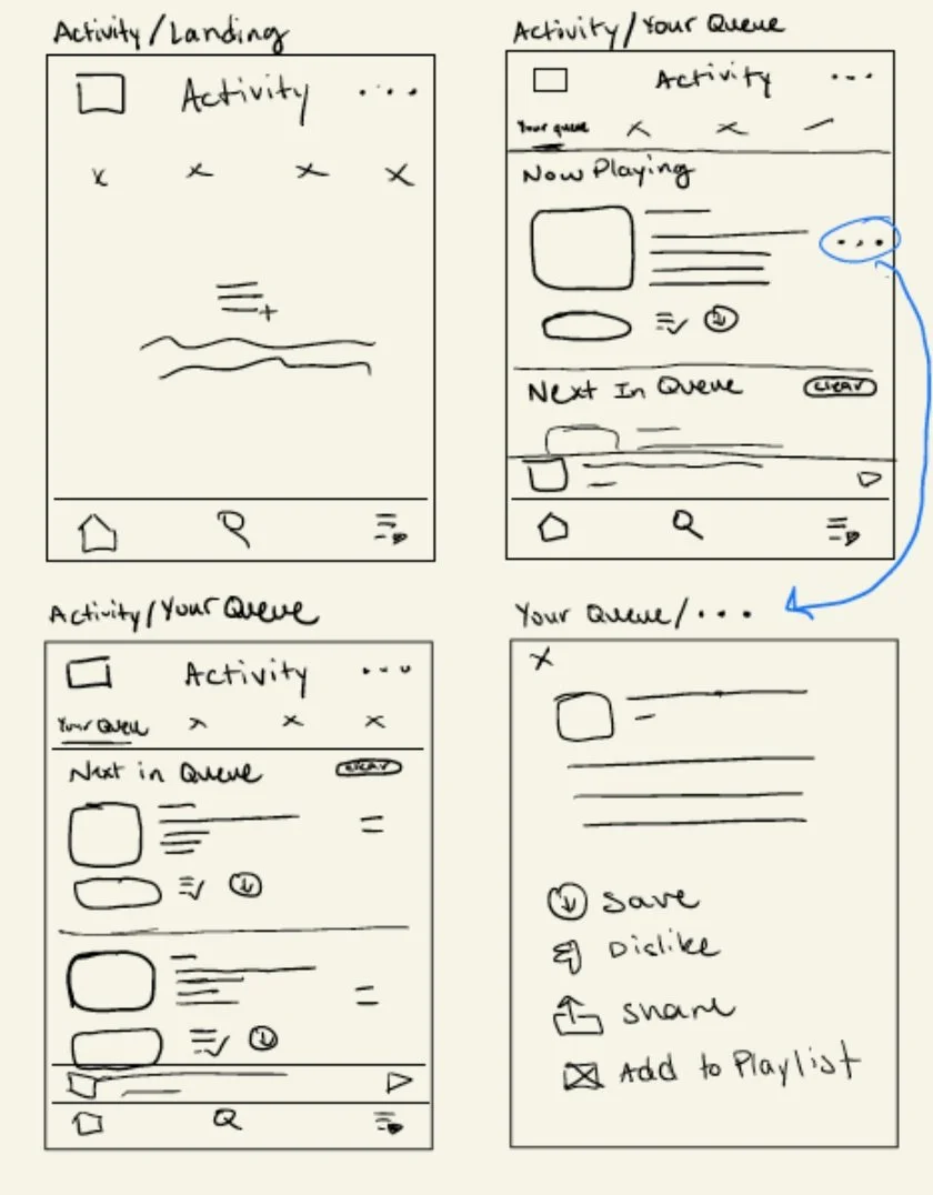
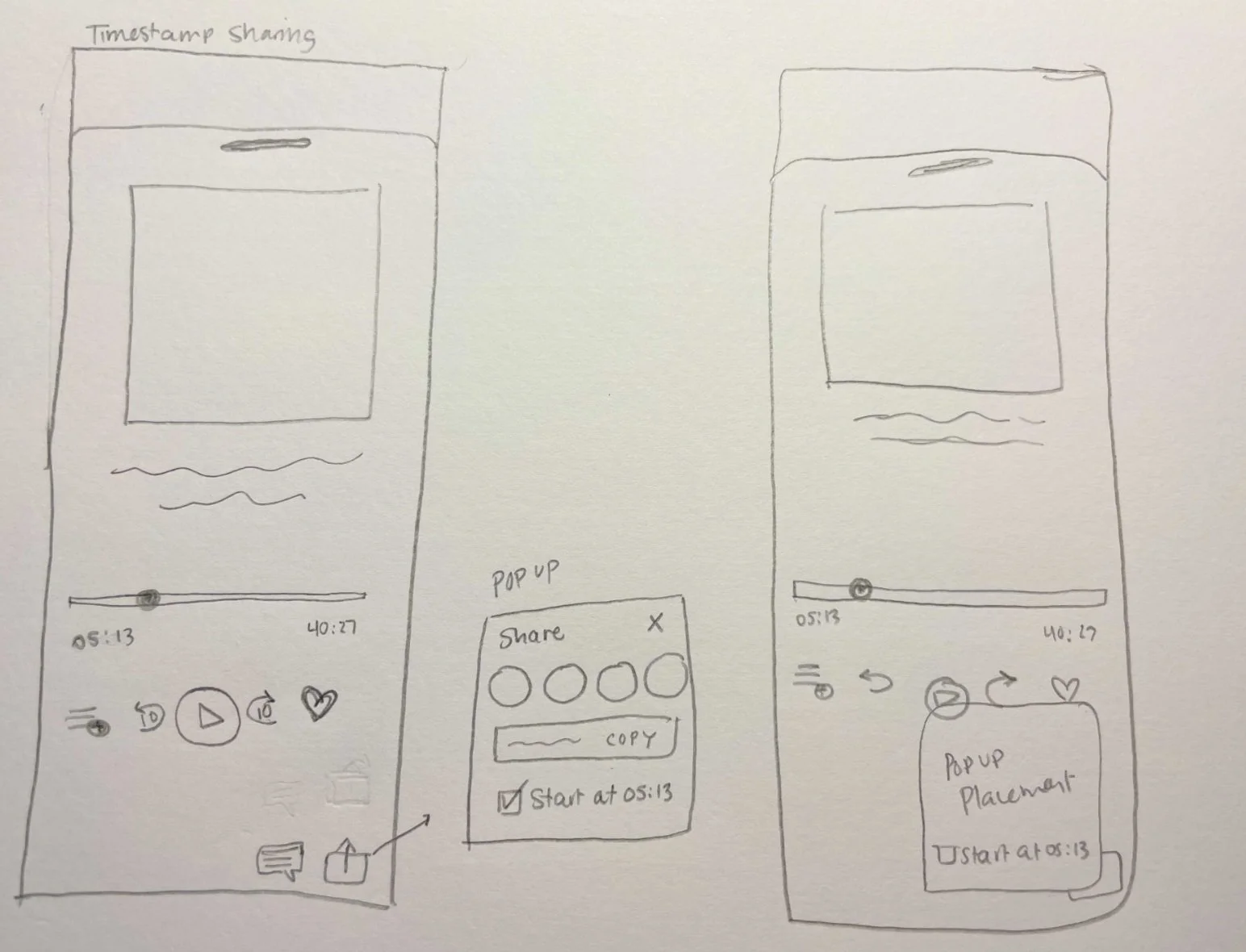
Now, with a thorough understanding of our users, we began sketching out our design concepts. The sketches below are of the Explore page, the Activity page, the Social/Profile page, and a possible time stamp sharing feature. We wanted to introduce innovative features not found in other applications and elevate the current platform by reformatting the layout and visuals.


New onboarding and time stamp sharing features
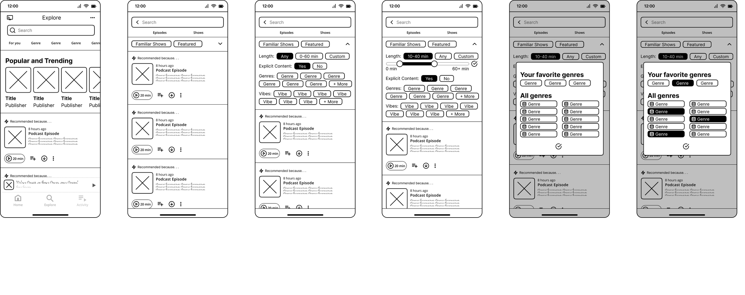
We created a low-fidelity design system and utilized it across all our wireframes to create cohesiveness. Below are some of the frames we designed for existing pages and for new features.
Redesigned explore page and newly implemented filtering feature
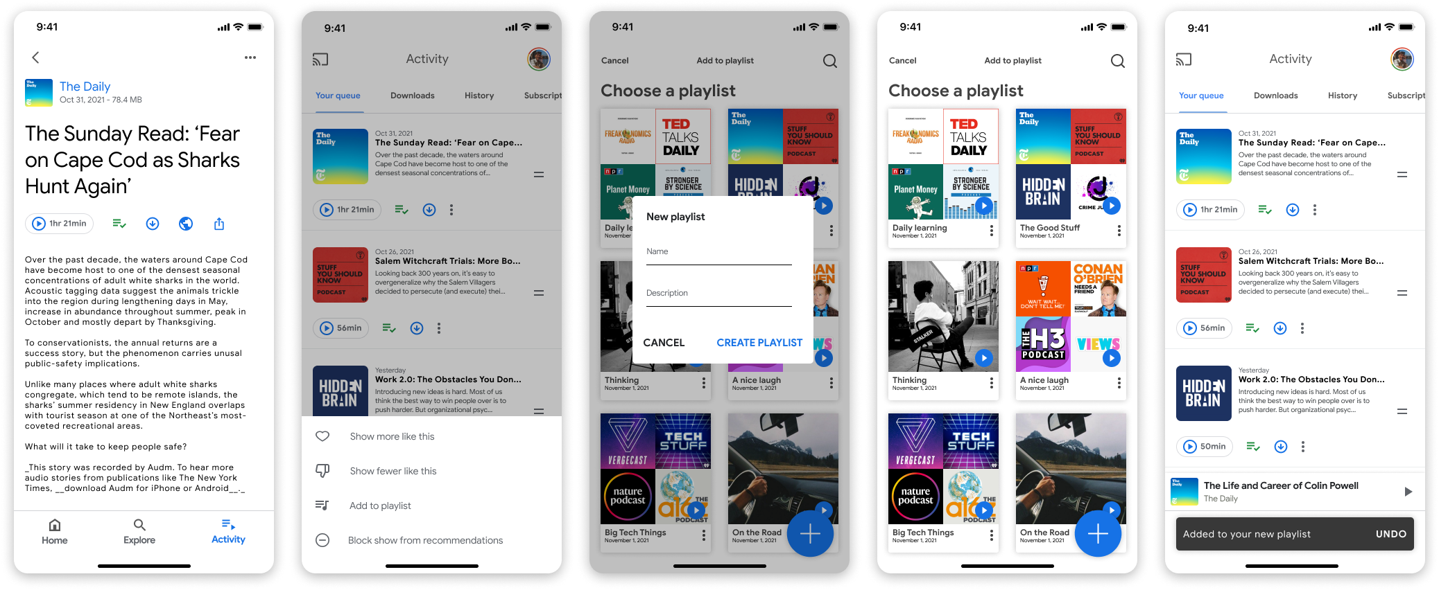
Redesigned podcast show layout and new playlist feature
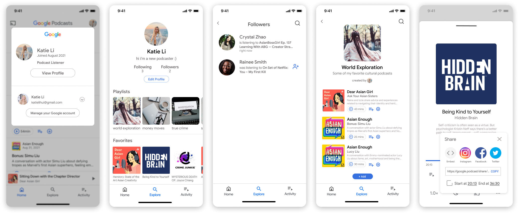
New profile and social features
High-Fidelity
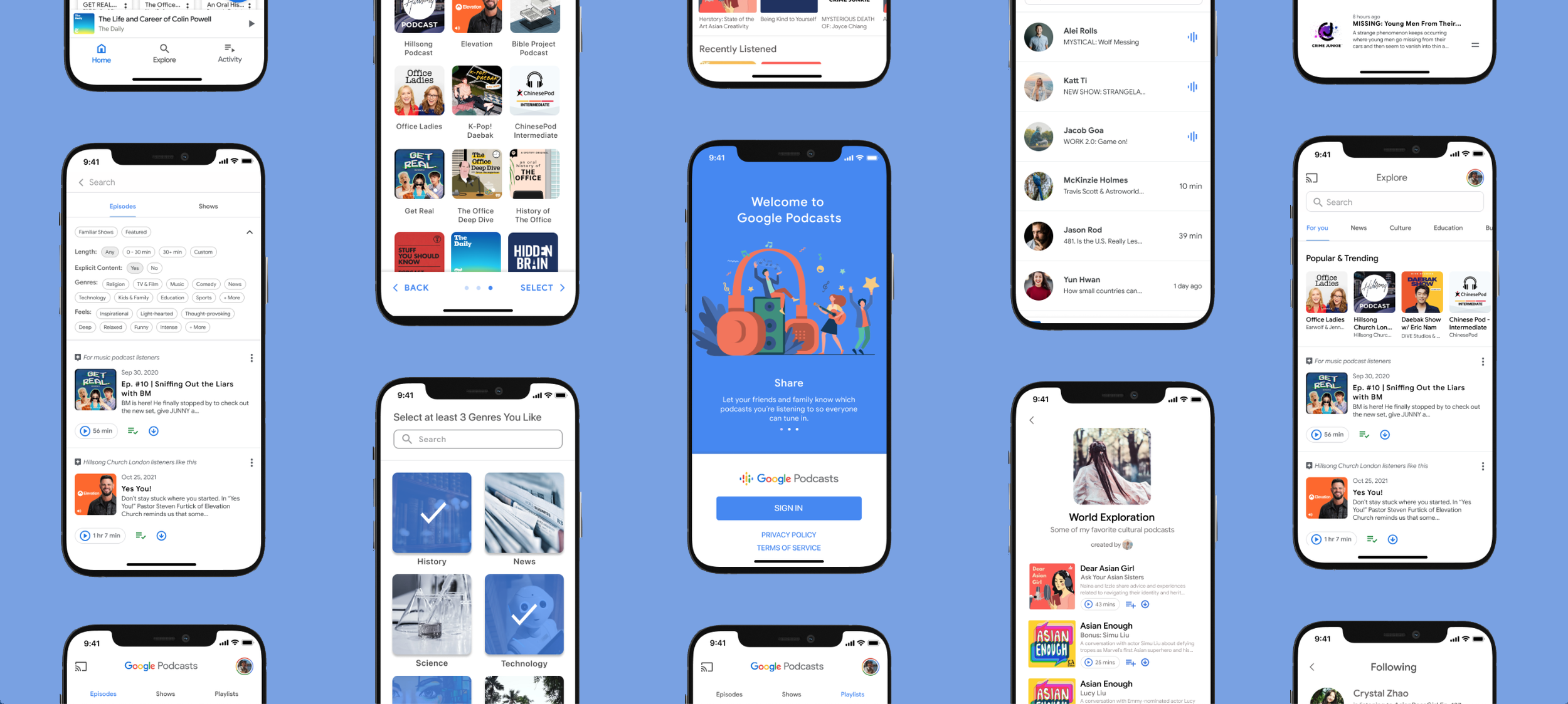
Utilizing our low-fidelity wireframes, we built upon them to create our high-fidelity mockups. We used Google’s Material Design system and their color palette to stay on brand while incorporating innovative features. Below are some of these mockups.
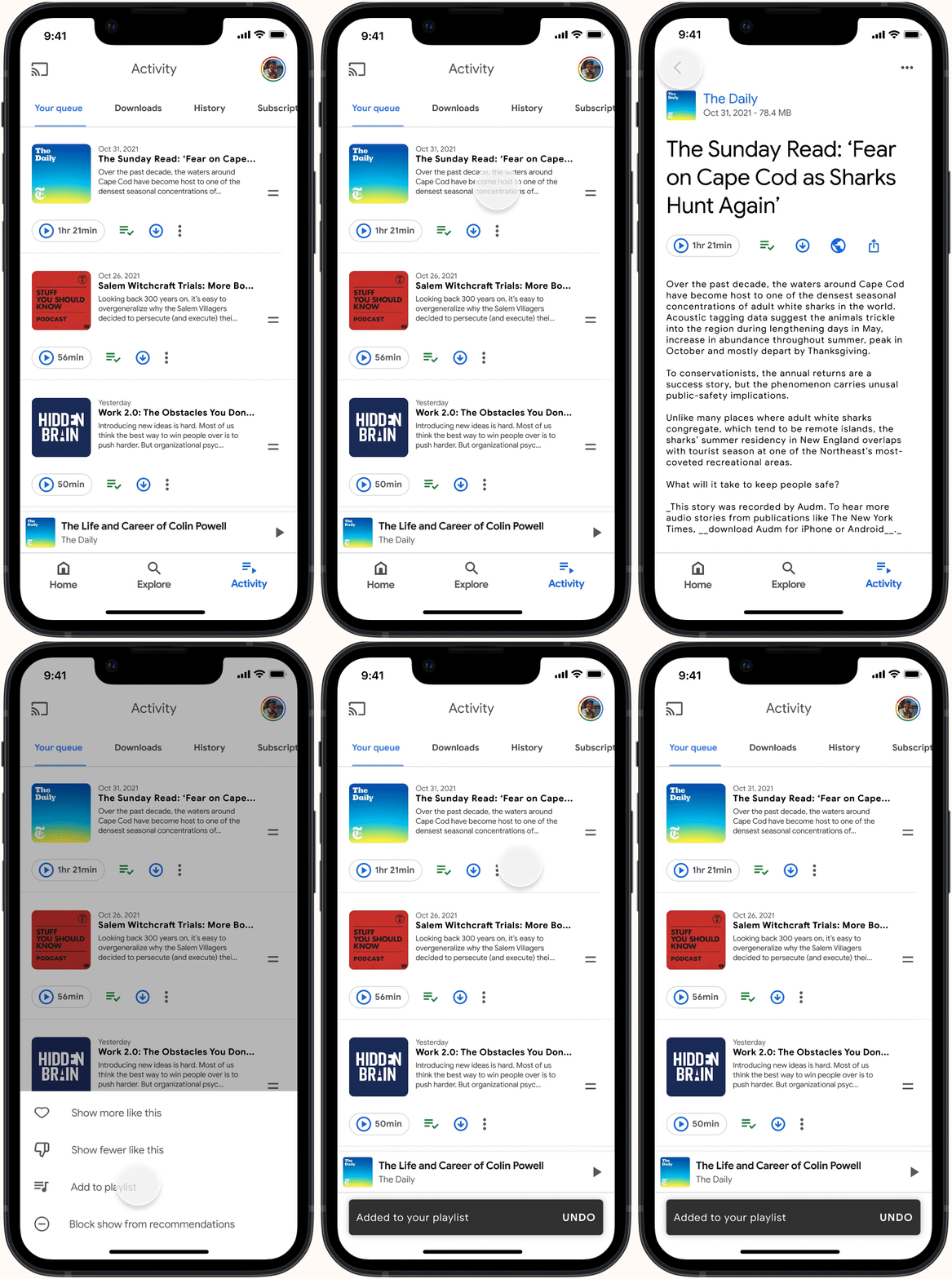
This is one of the new features we implemented to meet the user's needs for customization and better navigation. The playlist feature offers a way for users to organize their favorite podcasts and customize them to help personalize their app experience.
Playlist Feature
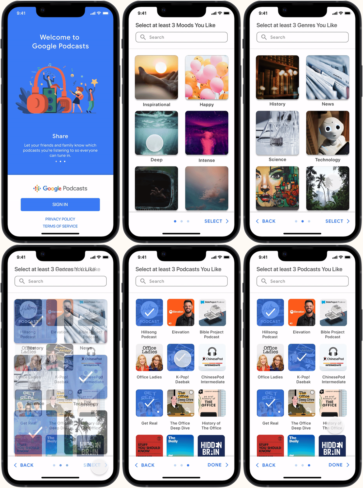
The current app does not offer any onboarding which made first-time user experiences require more effort to personalize the app information. We implemented this so when a user first downloads the app, they are able to begin their experience with confidence. Although the app can be intuitive, onboarding works to help tailor user preferences quicker.
Onboarding
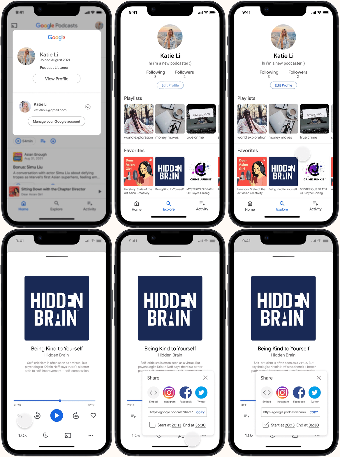
The new Social feature consists of a profile page and the ability to interact with other user profiles. On a profile, you will be able to see a user’s personalized playlists and curated favorites. Users are able to follow each other to create a community within the app allowing a more interactive and collaborative experience. We also implemented a new timestamp sharing feature. This feature is a way to make sharing specific podcast moments easier.
Social + Timestamp Sharing
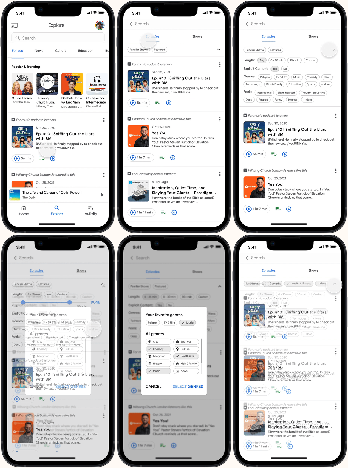
We redesigned the Explore page to increase efficiency in navigation. Through the search feature, we implemented a filtering system for users to easily find podcasts catered to their tastes. They are able to filter through podcast shows or episodes. We also changed the layout of the page to display different genres instead of just the Popular & Trending tab that the current app has.
Explore Page

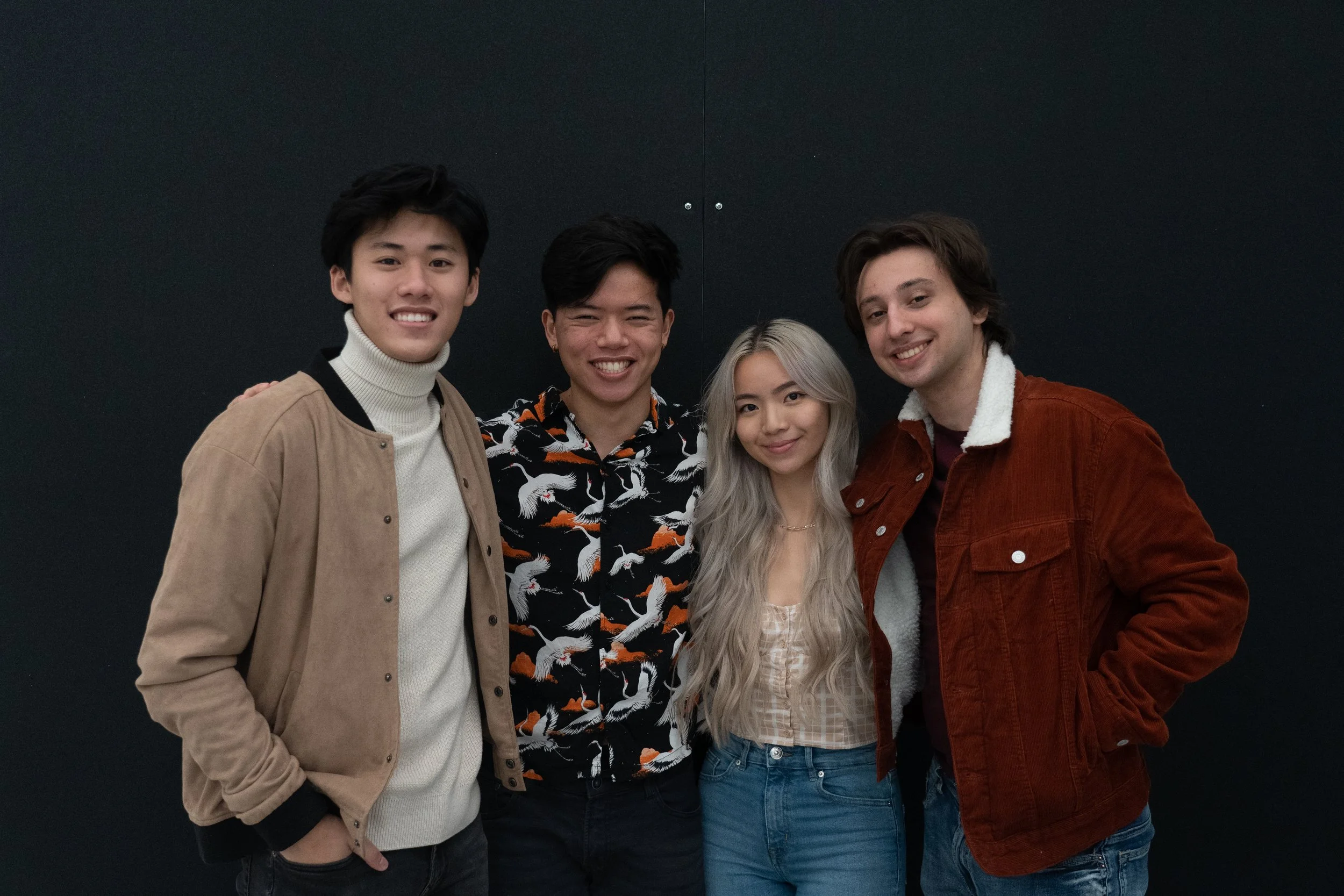
Working with my team was the highlight of this project because I got to learn from them and learn with them. We played to each other’s strengths and worked efficiently under a strict timeline.
Some lessons I learned:
Collaboration is a huge part of being a successful designer. This project gave me the chance to improve on my collaboration and communication skills.
Storytelling drives the presentation and final deliverables. It helps people understand your purpose and your journey.
Personal Goals
my team!

